Eat. Pray. Lockdown: My Pandemic Diet

For the past five years, I've been tracking my habits, health, and adventures—nearly every aspect of my life—with the Moji Mapper app. Each event in my life is represented by an emoji: 🍔 for food, 🍺 for alcohol, 💪 for workouts, 😍 for sex, etc.
This blog chronicles my life's data through maps, graphs, and visualizations. Follow along while I map out my life in 'mojis.
Today we'll look at my eating habits before lockdown vs after.
Today we’ll look at my eating habits before lockdown vs after. The obvious most drastic change was the shift from eating out at restaurants to home cooked meals.
Note: all these graphs are screenshots directly from the Moji Mapper app. You can set up custom keyword searches in Moji Mapper’s search bar, so you can easily compare events that match different keywords.
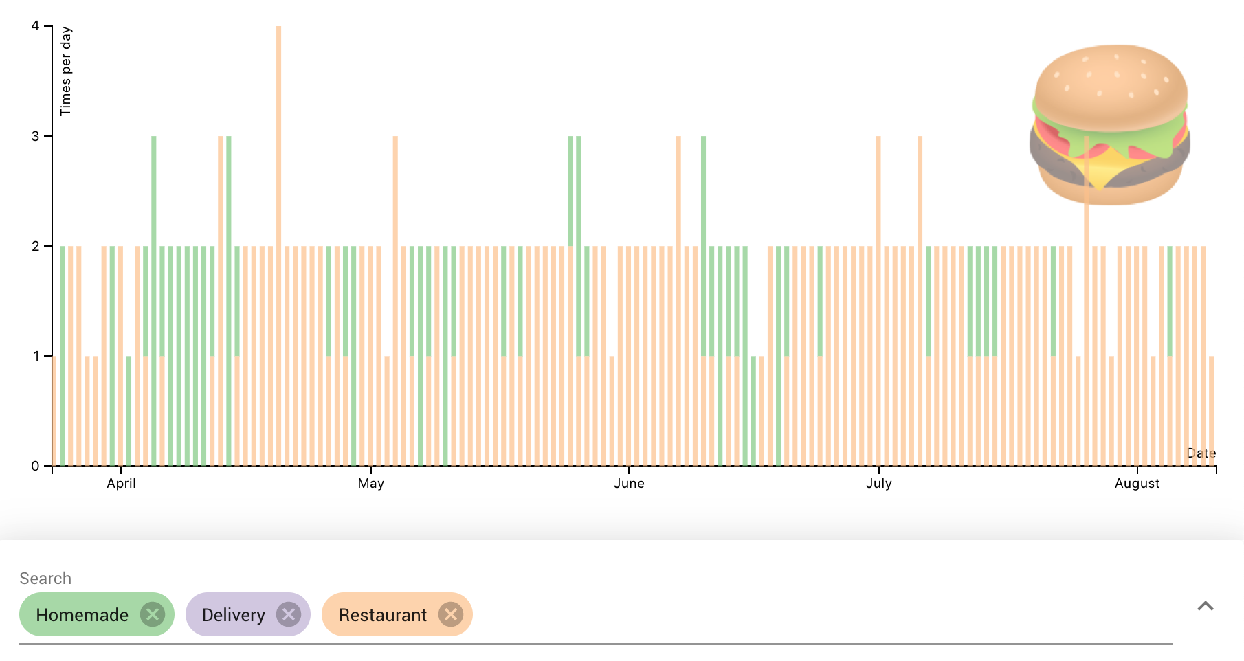
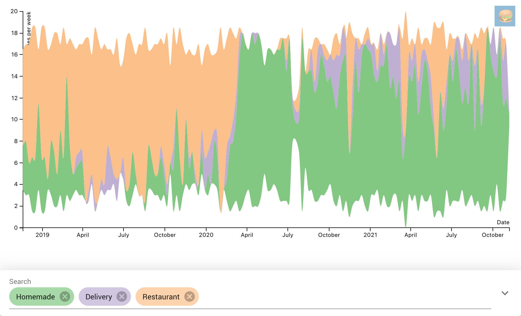 Homemade vs delivery vs eating out. Note the orange spikes when we went on vacation.
For a long while we weren’t even ordering delivery, out of overzealous Covid caution (that will be a common theme with me haha). It wasn’t until three months in when we tried delivery. Then we got used to the convenience (or maybe we were sick of my cooking!), and started ordering in regularly, about once per week.
The Before Times - A Foodie’s Paradise
San Francisco has some of the best restaurants in the world, so I was often eating out at new and familiar places, going on dates, etc. But you can tell, after lockdown, that foodie tourism had to come to an end.
Before
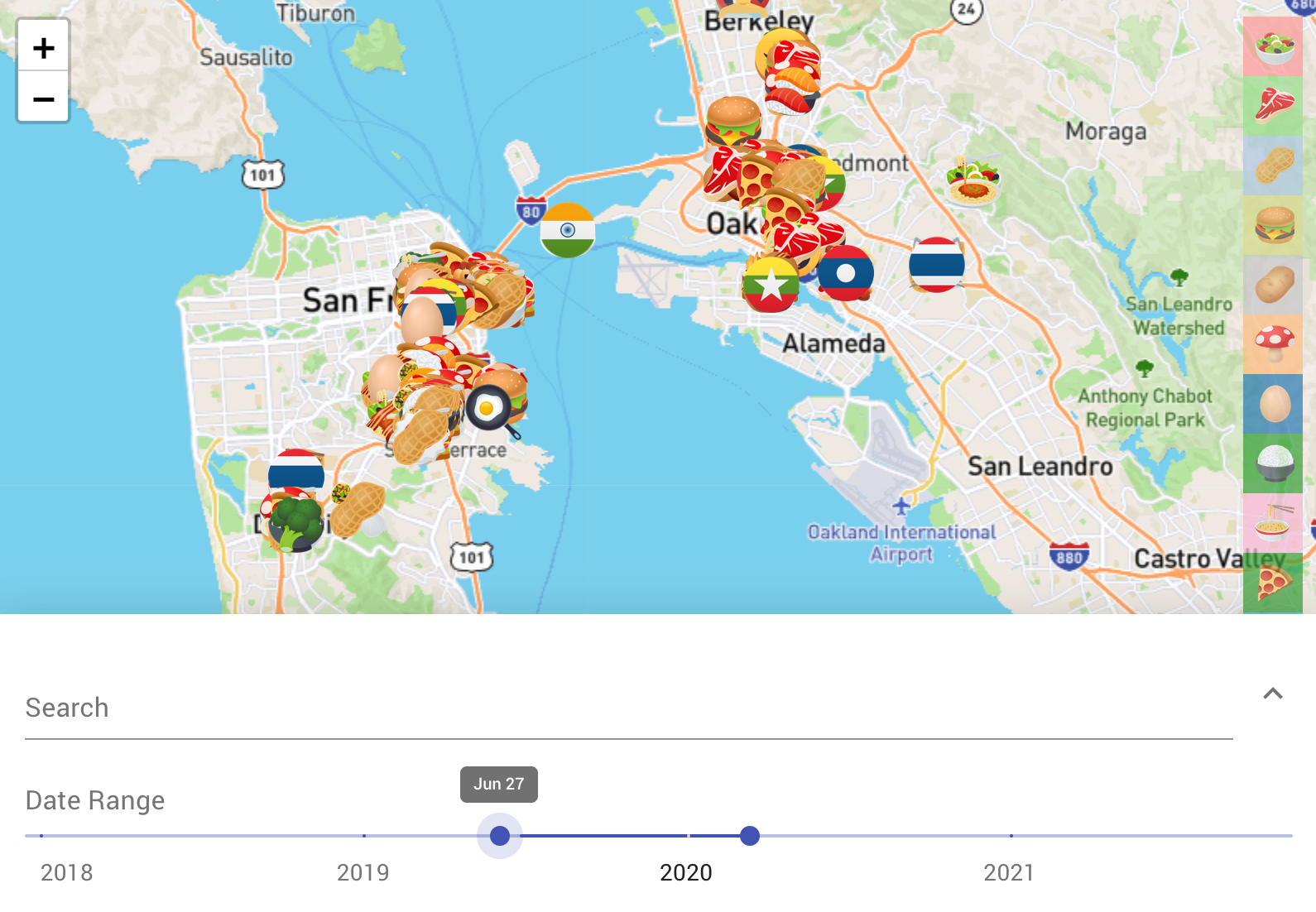 Eating before the lockdown. Moji Mapper logs my GPS location every time I log a ‘moji, so later I can see this map of everywhere I’ve been, what I did there, etc
After
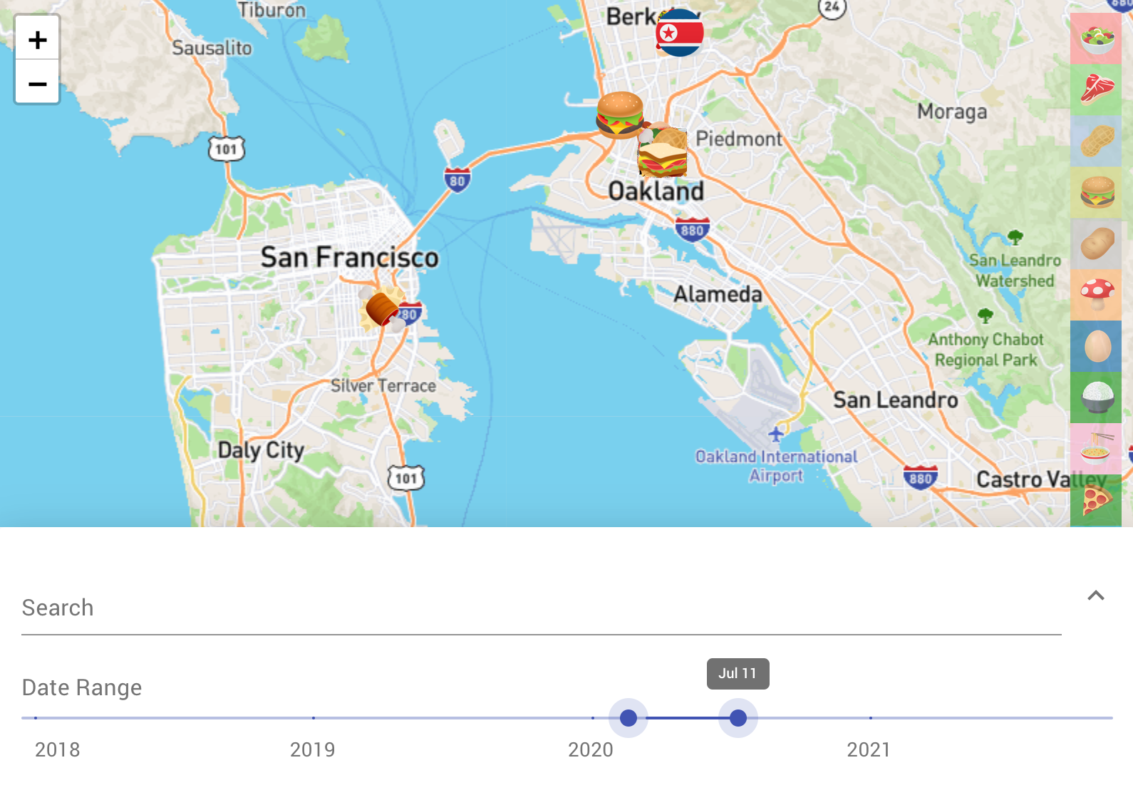
You can see after a while my wife and I did get brave and eat at a couple outdoor places.
My work has a cafeteria, so a lot of the “eating out” was at work, both for lunch and often dinner as well. You can see the frequency of eating at home rises sharply during the weekends.
After - Lockdown Lunching. Or: Home Cooked Woes
Once we were cooking at home, I started tracking who cooked each meal in the notes in Moji Mapper.
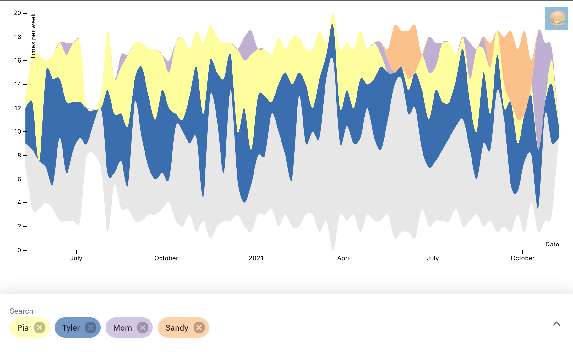
My wife Pia and I both cook, but it looks like I cook the majority of the time. That’s ok though because I love cooking. She does the dishes 😉
You can see several purple or orange spikes when we were visiting family and our moms cooked.
In-person Meatings Not Allowed
I pretty much exclusively cook vegetarian food, so when lockdown happened, I basically stopped eating meat. The only times I did eat meat was when getting delivery.
Before
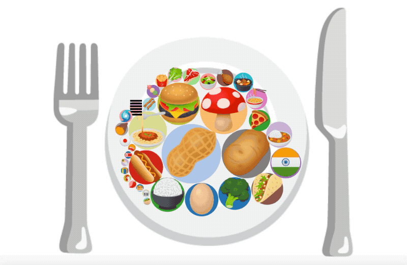
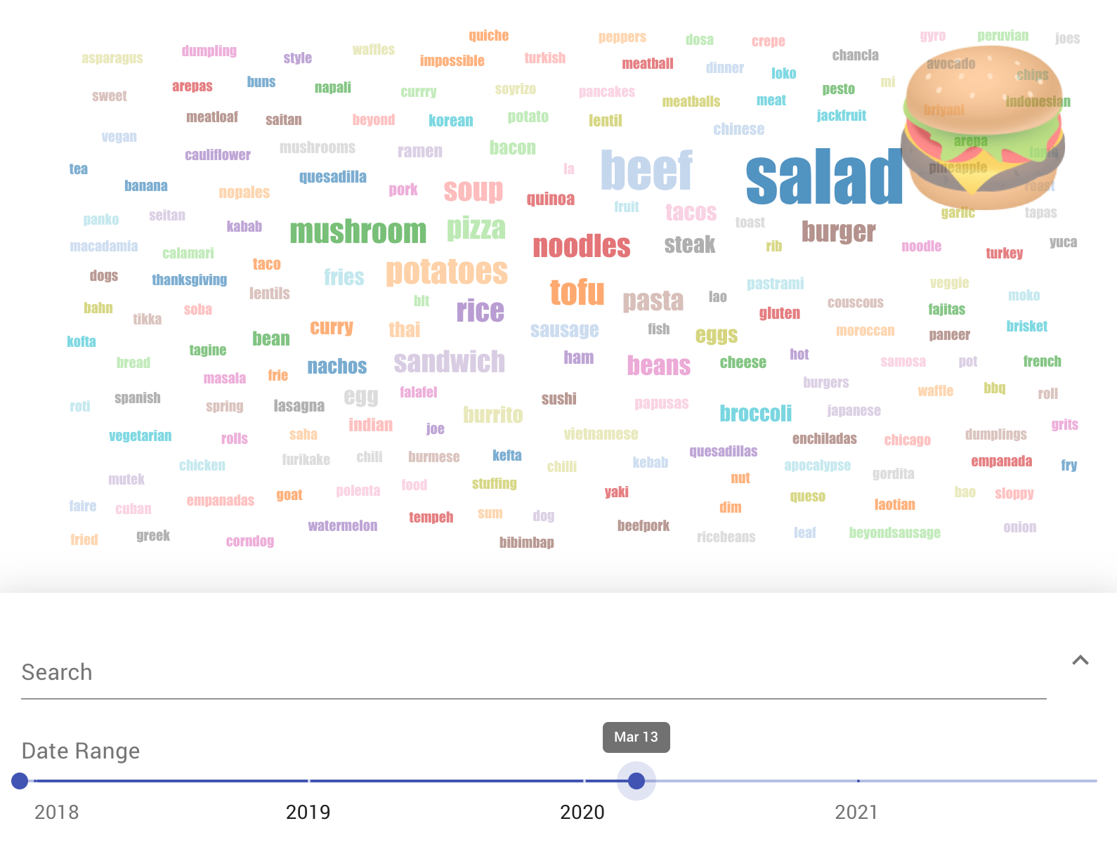 Breakdown of what I ate before lockdown. Clearly hitting up that salad bar at work a lot.
After
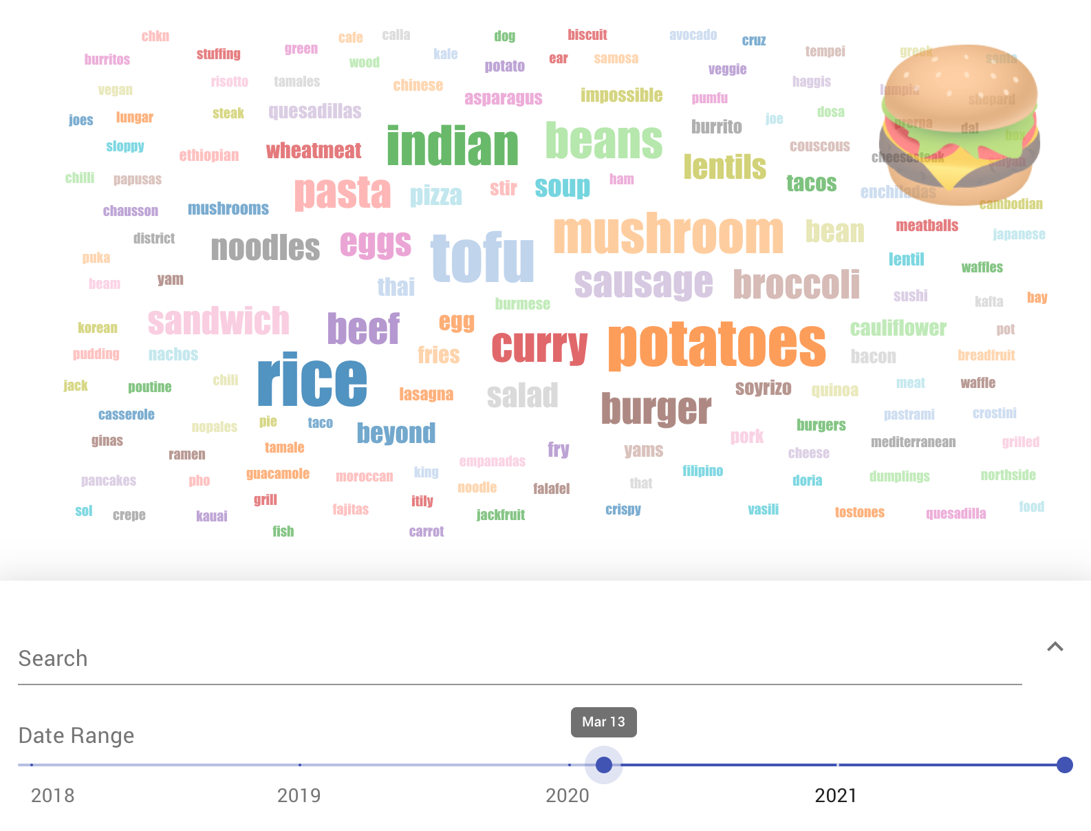 Pia moved in with me during lockdown, so that’s where the big uptick in Indian food and curry is from.
Interestingly, I stopped eating salad at the beginning of lockdown because we were worried about contaminated food (remember that?): so we cooked all our veggies. That is, until our garden started producing.
Moji Mapper can even make timelapse videos, so here’s a timelapse of all the types of food I ate from 2018 to 2021:
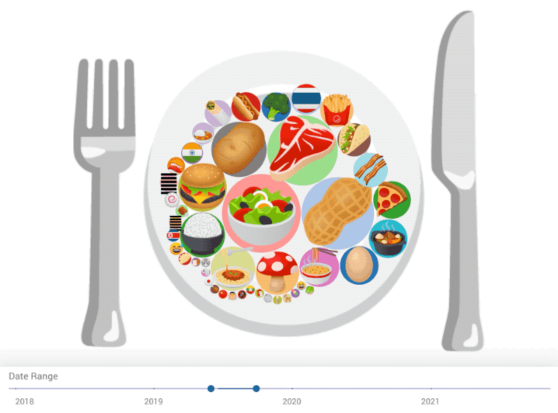 PS: I used “peanut” instead of “beans” and “tofu” emojis since the “bean” emoji literally just became part of the standard a few weeks ago. That’s the nice thing about Moji Mapper: each ‘moji you pick has a special, secret meaning that only you know about.
So that’s my food journey for the past four years using Moji Mapper. If you’re interested in quantified self or tracking your own life via emojis, you can download Moji Mapper for free here. And if you’d like to see more updates like this, you can subscribe to the newsletter below.